A multi-platform support system that helps users notice, record, and reflect on microaggressions in daily life.
Interactive & Industrial Design

A subtle comment, a silent reaction, and a lingering discomfort.
Easee was born from those unspoken moments, designed to help people notice, reflect, and heal from everyday microaggressions.
We often hesitate to react when something feels “off.”
A casual comment, a strange silence and it lingers.
This short motion storyboard visualizes those subtle emotional moments that inspired Easee.
ROLE
UI/UX Designer
Industrial Designer
SKILL
Figma
Rhino
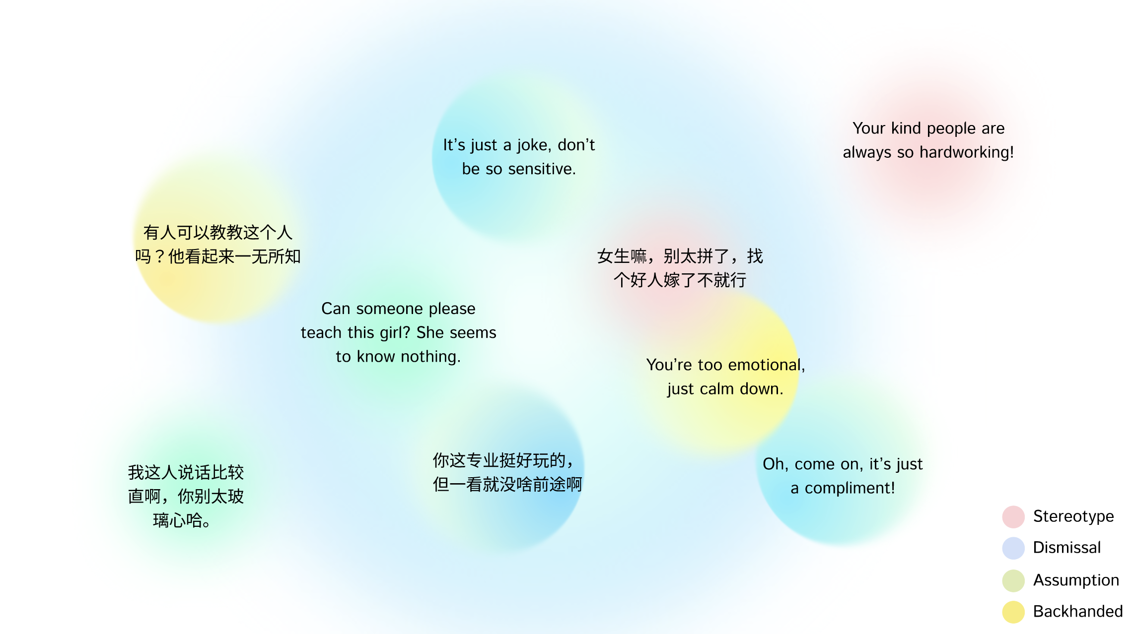
The Words That Linger
Some words sound ordinary,even kind, but stay with us long after they’re spoken.
These are the subtle comments, half jokes, and careless phrases that leave quiet marks on how we see ourselves and others.
What happens after these words are spoken isn’t always visible, the moment passes, but the feelings stay.
Understanding the Unspoken
Emotion Journey Map
Every story followed a similar rhythm, a small discomfort, a pause, and a lingering replay afterward.
This journey map visualizes how participants emotionally moved through those moments, from initial confusion to eventual clarity.
The Turning Point
After listening to all these stories, I realized the hardest part wasn’t the words themselves, it was the silence that followed.
I wanted to design something that could hold that silence, gently.
In response to these invisible moments, Easee was designed as a calm ecosystem that helping users notice, reflect, and respond to discomfort in daily interactions.
Design for Empathy
From Emotion to System
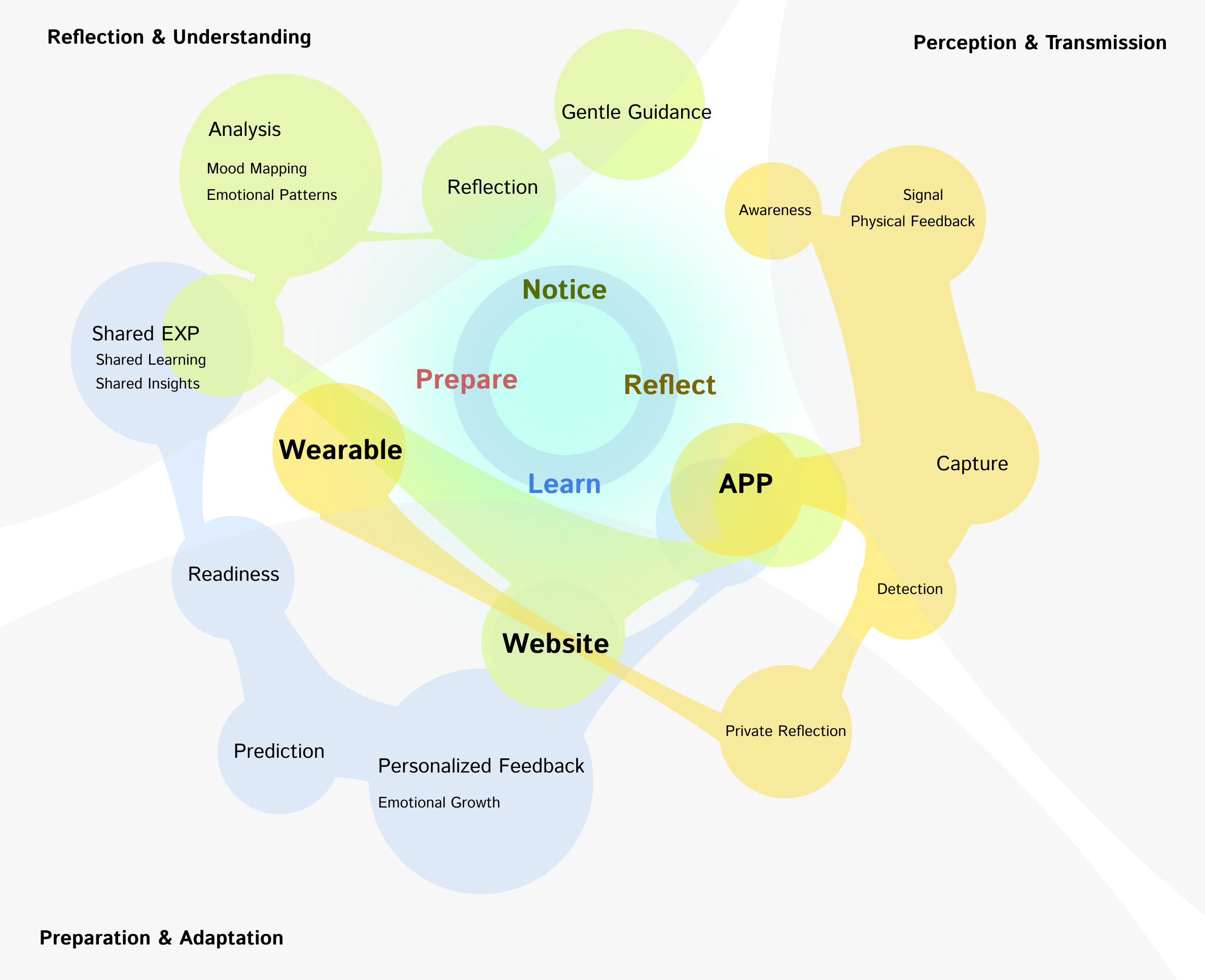
Easee connects emotional awareness with design interventions across three touchpoints as wearable, app, and web.
Each component mirrors a stage in the user’s emotional journey, creating a seamless flow between noticing, reflecting, learning, and preparing.
System Moving with Emotion
Easee moves with sensing subtle shifts, reflecting with empathy, and turning awareness into gentle understanding.
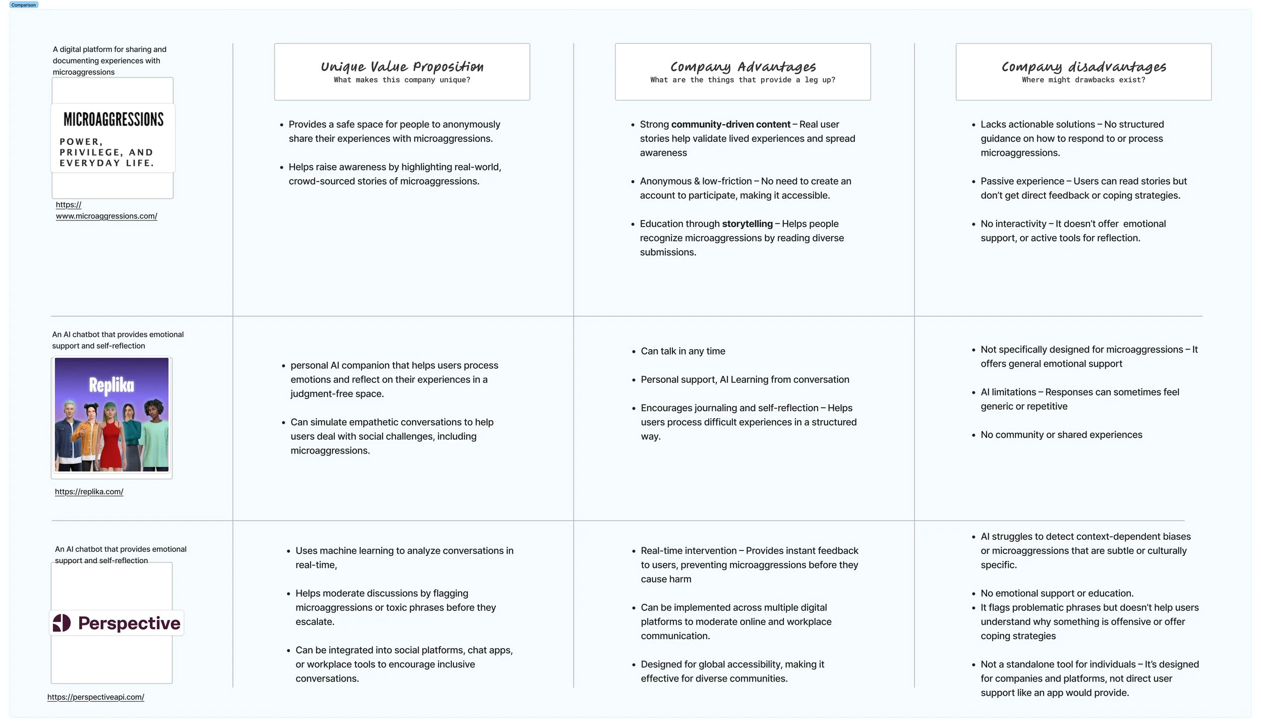
Related Research
Design Decision
Based on the user journey, I designed two distinct yet connected flows to reflect how people naturally interact with microaggressions over time:
Quick Capture Flow
For the moment something feels off, users need a fast, lightweight way to record what happened—without overthinking or breaking social context.
Reflect & Analyze Flow
Later, when users revisit the incident, they’re often seeking clarity or closure. This second flow guides them through emotional insights, repeated patterns, and personalized strategies.
Design for coevolution
The system evolves with every feeling. Each recorded moment becomes a small data seed, shaping how the system understands and responds the next time.
A Language of Gentle Beginnings
The palette carries the rhythm of early spring which are calm blues and soft neutrals holding space for renewal.
Accents bloom like quiet thoughts: green for progress, yellow for warmth, pink for compassion. They appear lightly, never loud, reminding that awareness doesn’t demand intensity but only presence.
When Systems Begin to Understand
Easee’s interface doesn’t end at a single tap; it circles back, learning from what the user chooses to keep, to release, or to ignore.
Each reflection reshapes the next suggestion that small adaptations, imperceptible but real.
Key Design Challenge:
Challenge —— The Quick Incident Check in was designed as a pop-up window.
Insights —— User feedback revealed that this interaction felt intrusive. The pop-up was seen as disruptive, creating a sense of being “trapped” in a task they didn’t intend to perform.
Solution —— The design was revised to embed the check in module at the top of the dashboard.
This anchored placement allows users to open it only when needed while still viewing the rest of the page. The solution preserves context, reduces friction, and gives users more autonomy in how they engage with the system.
Before
After
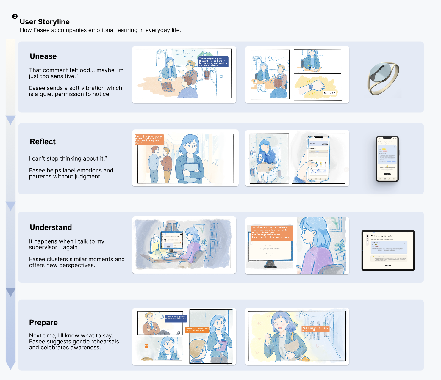
From Unease to Readiness
Every interface began with a moment of discomfort, a quiet pause, a choice to look inward.
The storyboard traces that journey: a person hesitating after a careless comment, finding words again through reflection, and walking lighter.
It’s not a solution, but a mirror to show how design can hold silence until understanding returns.
Mobile version
Web version
Reflection
The origin of this project came from my own experiences with microaggressions,those moments when I froze, unsure how to respond.
As I interviewed others, I realized how many people had felt the same: some couldn’t sleep, replaying the words, blaming themselves.
Reading their messages, I saw a shared wish for a tool that could tell them what to do, help them stay strong, or simply remind them that it wasn’t their fault.
My high empathy made me want to help them, and in doing so, help myself.
Perhaps that’s what design truly means to me: it can reveal unseen needs, and to give visibility to those who carry them quietly.
Yet I also feel powerless, knowing this is only a student project, one that may fade with time and remain somewhere in this year…..


